I know how to make design tradeoffs that prioritize user’s adoption velocity. I can balance competing requirements, translate specs into complete workflows, and coordinate with distributed teams to ship fast. Exactly what was needed to de-risk this high stake NFI.
We called this feature "Digital Credentials"
It was one of those projects where we were building the plane while flying it! IBM Verify needed to support decentralized identity // think of mobile driver's licenses in your digital wallet, employee badges without physical cards.
Tech behind this is brand new and bleeding-edge, and we were doing it without a PM for significant stretches. And across industries, digital identity adoption is inconsistent and fragmented. That’s the challenge. Each organization handle credentials differently, often treating them as "static data" rather than portable proof.
IBM’s goal was ambitious: to modernize credentialing into a single, flexible system that could issue and verify credentials across jurisdictions without compromising enterprise-grade security, governance, or interoperability.
My task was to move the team from abstract cryptology to a shippable "Issuer & Verifier" experience that proved IBM could handle the world’s most sensitive digital credentials.
ROLES / RESPONSIBILITIES:
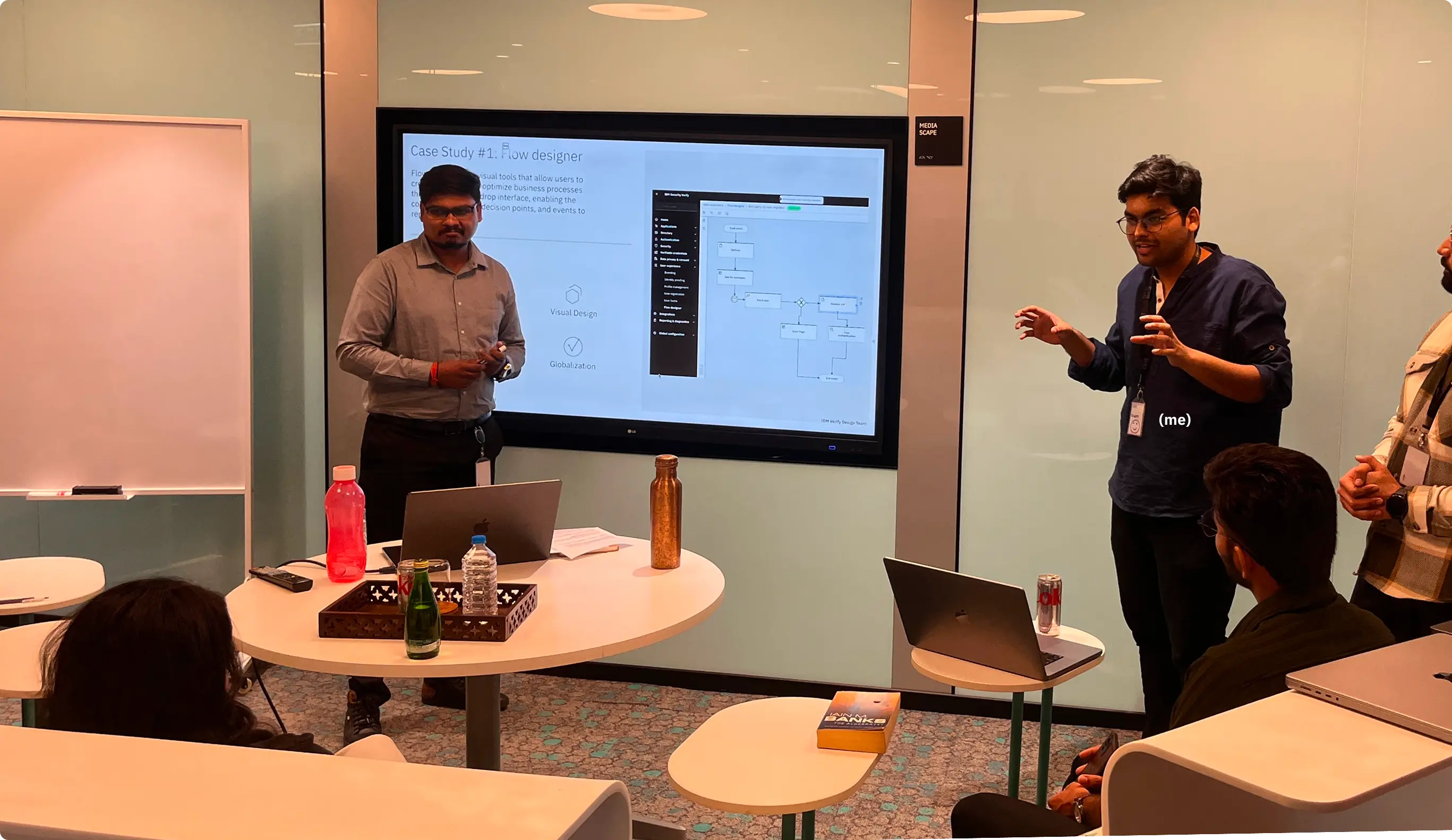
- Rachit Mathur (me, UX Designer)
- Joe Raffone (Design lead)
- Joanna Greaney (Content designer)
- Aryan Anand (Visual Designer)
- Tom Reavely (Researcher)
Joe trusted me to micro-lead. That’s about coordinating with architects in Australia, the US, and devs in India. Probably because I asked enough annoying questions that everyone figured I might as well wrangle the answers.
The feature existed technically, but it was "almost unusable and fragmented," as Joe put it. Admins needed to configure trust frameworks, credential schemas, and verification protocols. But the experience was scattered across disconnected tech concepts.
People were stuck. Our architects were brilliant but thinking in specifications. Devs needed designs to start building and the team had been circling the "understanding phase" for weeks with no clear path to lo-fi designs.
Business stakes were high. We had competitive customer deals on the line. This was a major SaaS strategy pillar, and we were de-risking it without dedicated PM support.
If we could crack this, IBM would position itself as a standards leader in decentralized identity. But first, we had to figure out what the hell admins were supposed to configure, and in what order!
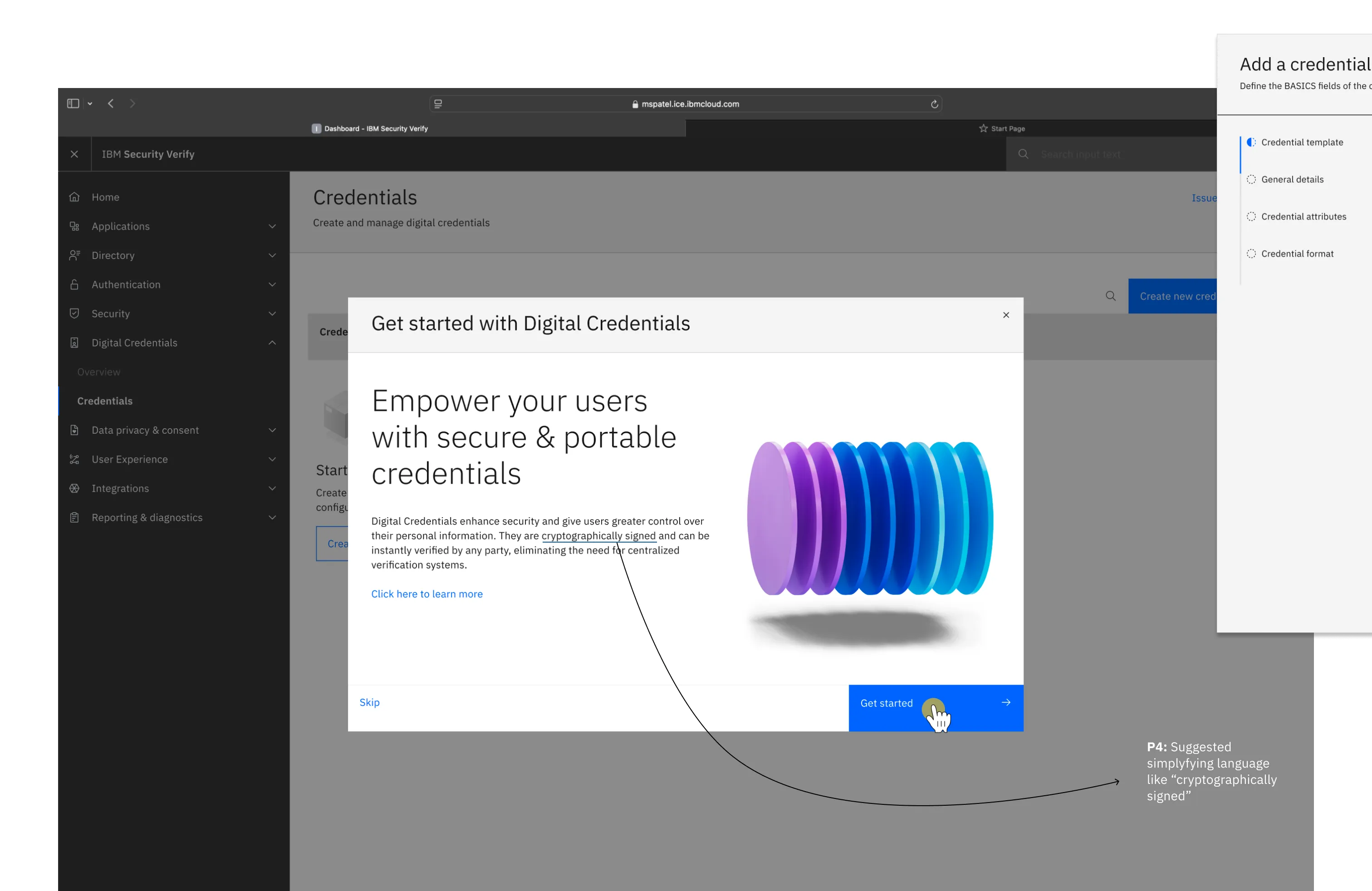
In a brand-new technology space, the name IS the first mental model. Get it wrong and you're explaining instead of selling.
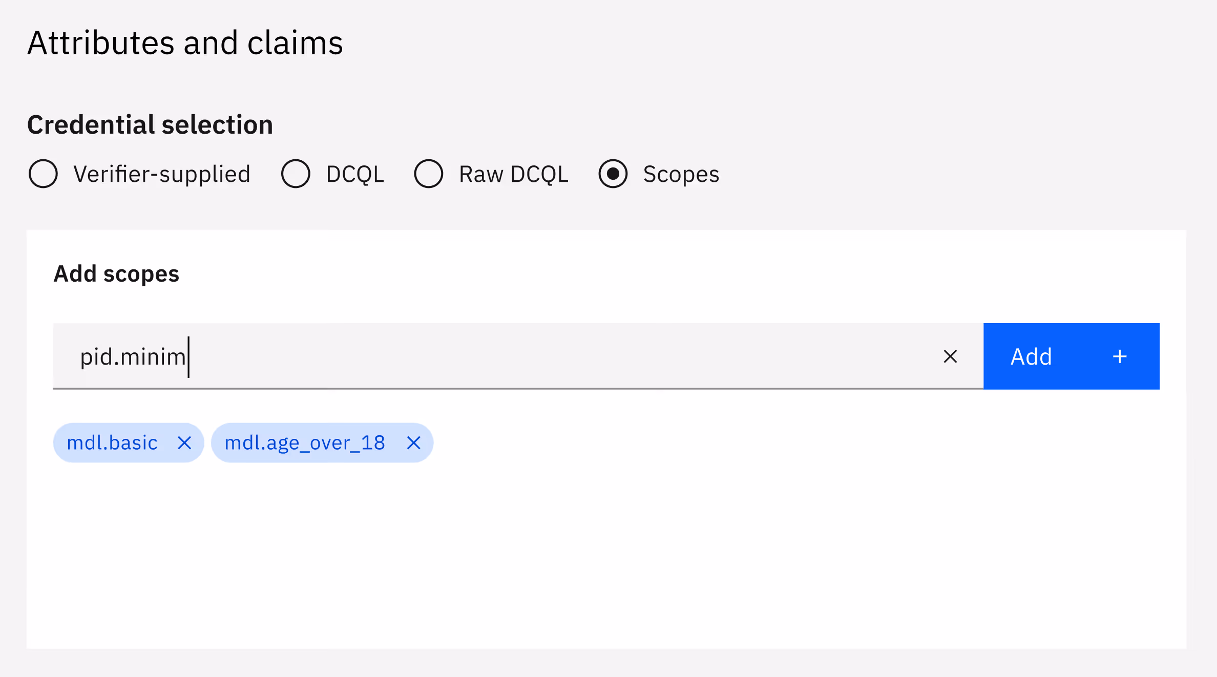
Initially, we were building a product for "Verifiable Credentials," but our discovery research showed that 44 key stakeholders in Europe found the term confusing and redundant.
The term "Verifiable Credentials" is the industry standard, but "IBM Verify-Verifiable Credentials" also sounds ridiculous (!) apart from it not being self-explanatory at first place.
It was what architects wanted. But I argued for Marketability over Technical purity. We sacrificed the "industry-standard" name to ensure our customers (and our own sales team) actually understood what they were buying.
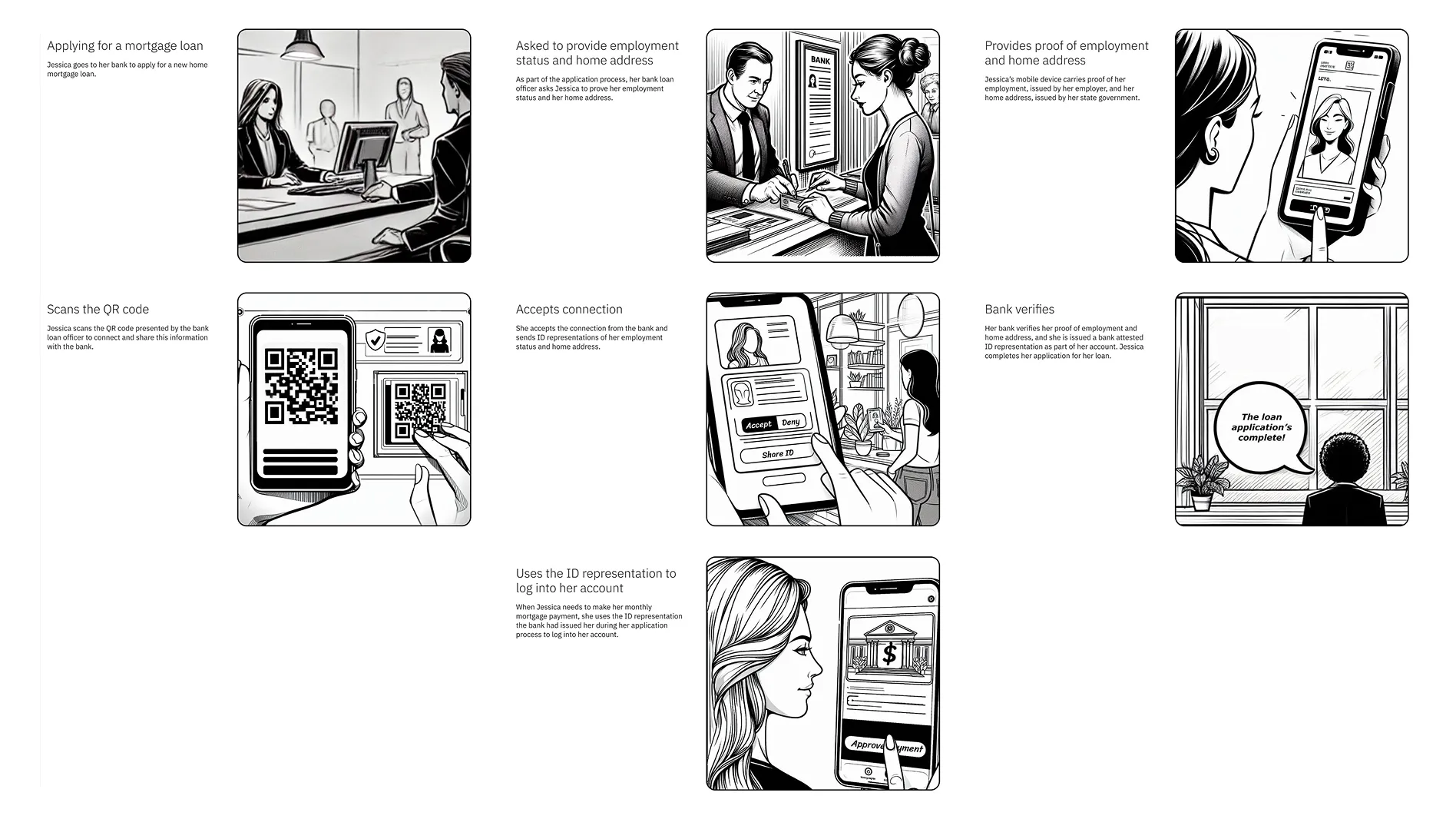
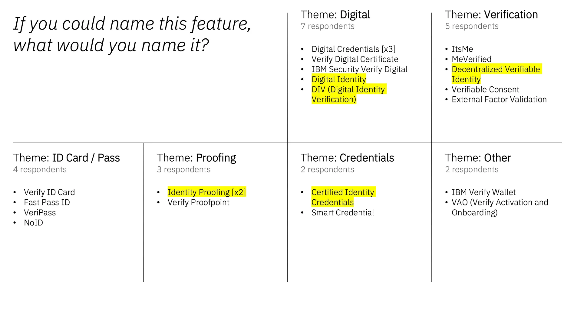
To find the right term, I led a storyboarding exercise to move the conversation from protocols to people.
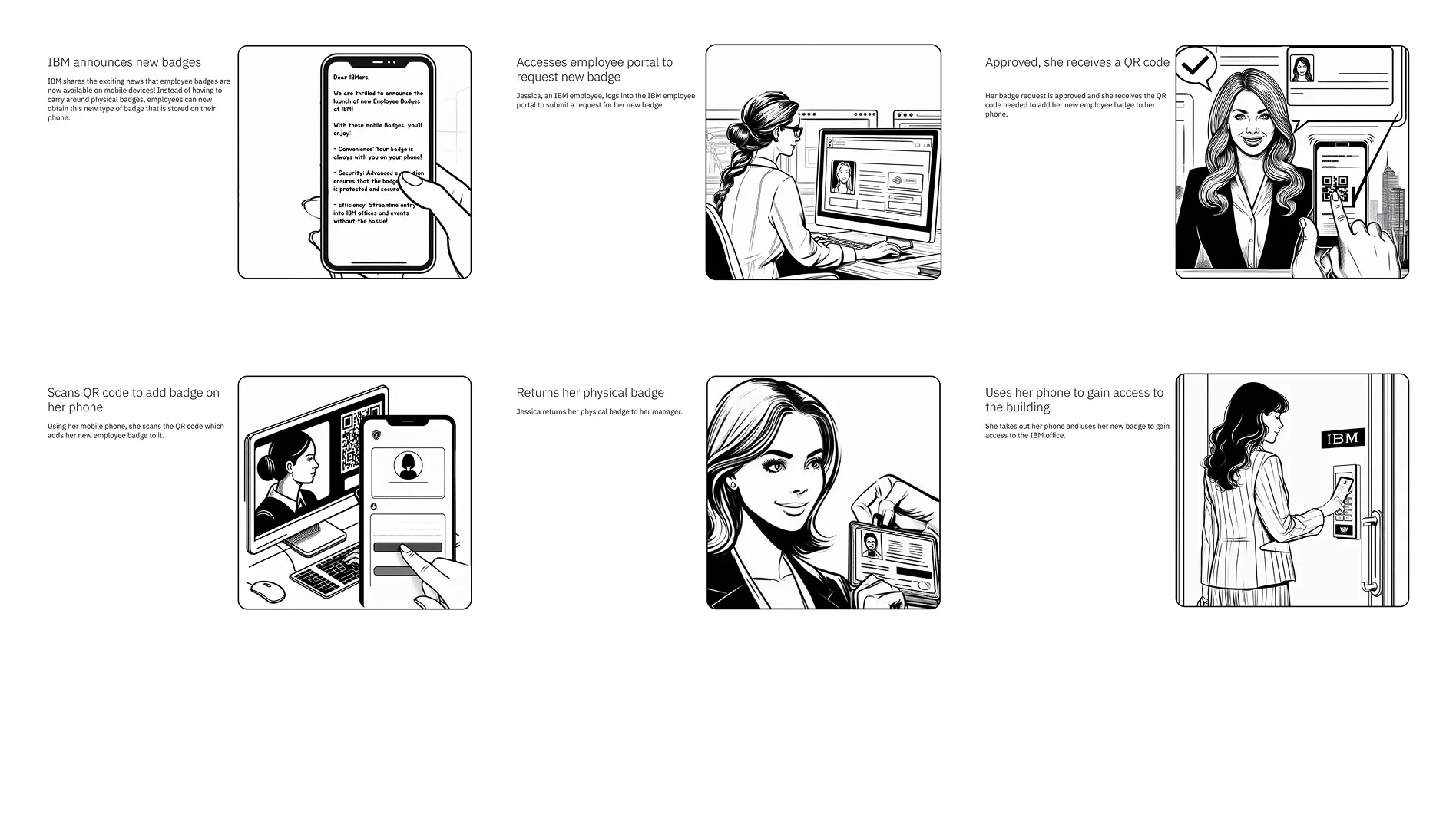
We followed Jessica, a citizen applying for a mortgage, as she navigated a scenario everyone could relate to. Her employer issued her a digital proof of employment. When her bank asked for verification, she shared it from her digital wallet - cryptographically verified, no paper trail, no faxing HR departments.
By visualizing this human benefit, we shifted the entire feature’s nomenclature to "Digital Credentials." Once everyone saw Jessica's journey, this name debate became clearer.
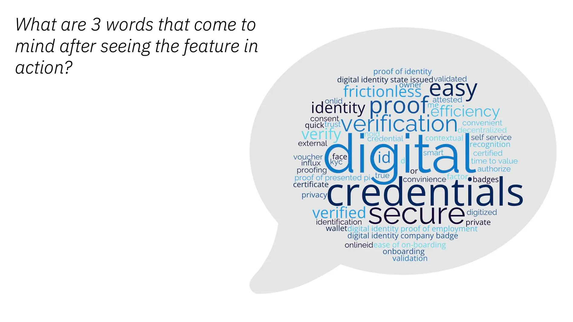
"Digital Credentials sounds much more in tune with what we're trying to do. When I hear 'credentials,' I think username and password. When I hear 'digital credentials,' I think about my entire identity profile."
- IT Architect (Ohio DAS)
For 3 weeks, architects, devs, and design talked past each other. We were all describing the same thing with different words, and nobody could agree on what the core object even WAS. We'd been circling the "understanding phase" with no clear path to designs. Devs needed something to build. We needed to ship mid-fis. But we couldn't design what we couldn't define.
To get the team unstuck, I co-led OOUX (Object-Oriented UX) workshops.
We stopped talking about "features" and started talking about "Objects."
I facilitated the key discussions, that successfully remodelled our backend. We weren't just "designing a UI"; we were fixing the product architecture. This session compressed 3 weeks of circular meetings into 6 hours of high-intensity alignment.
- Objects (not features): Credential Definition, Trust Profile, Issuer Profile, Attribute, Format, Signing Key ...and so on
- Actions on each object: Create, Configure, Publish, Revoke
- Relationships: Credential Definition HAS attributes, USES signing key, REFERENCES trust profile
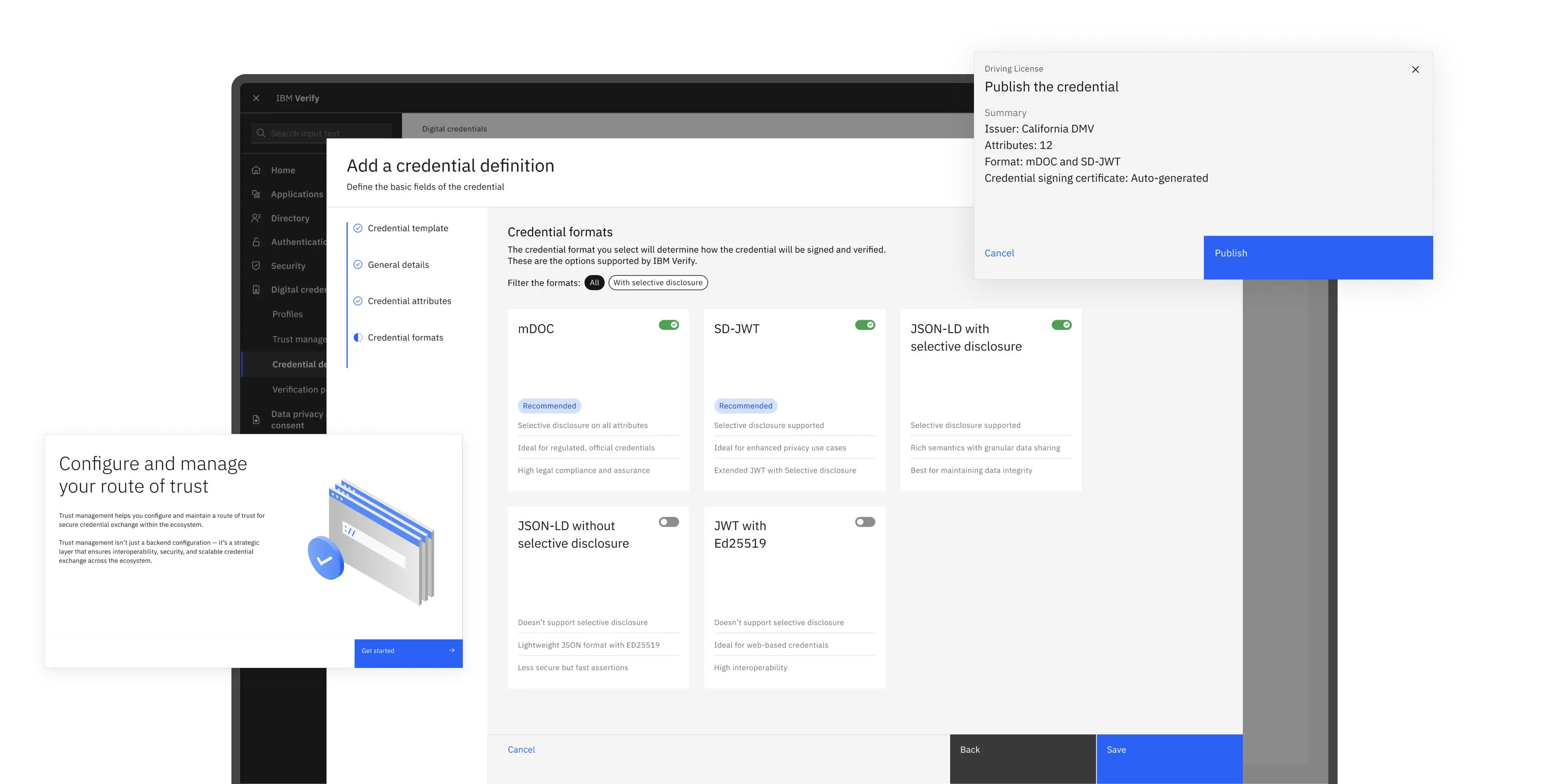
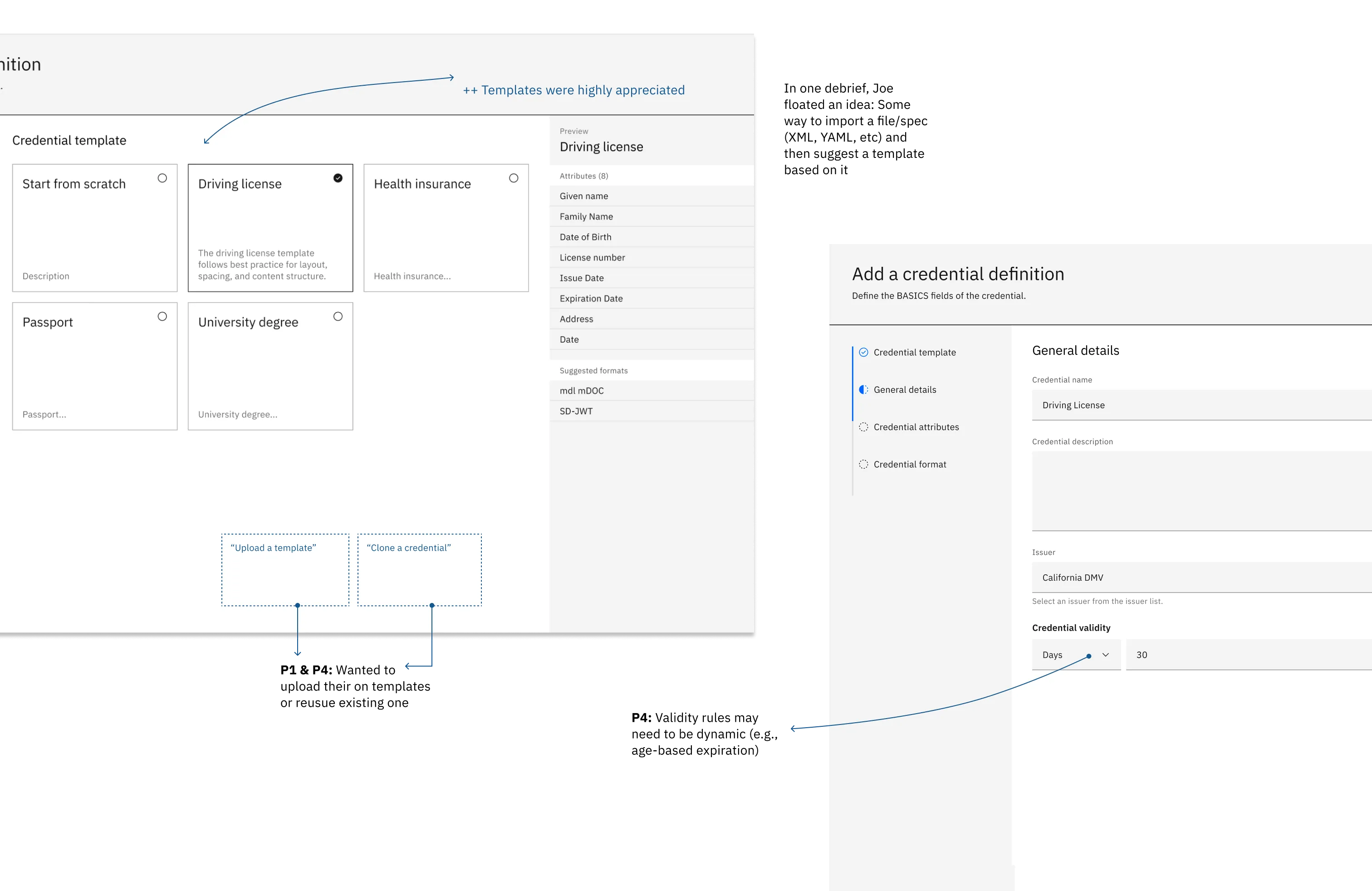
David Moore, our architect, pointed at our diagram and said: "That big vertical block called 'credential' - that's not named correctly. That's not the credential that gets into Jessica's wallet. That's a credential DEFINITION." Boom.
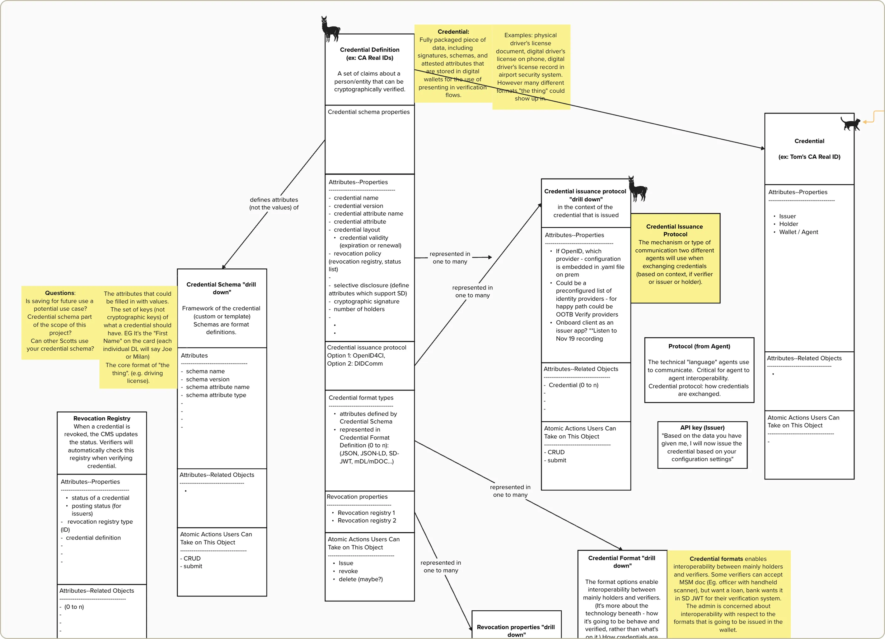
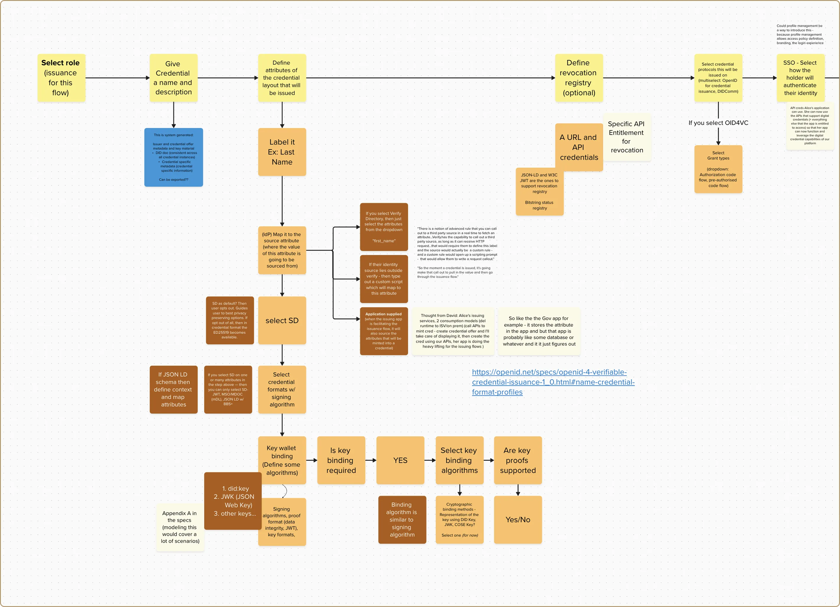
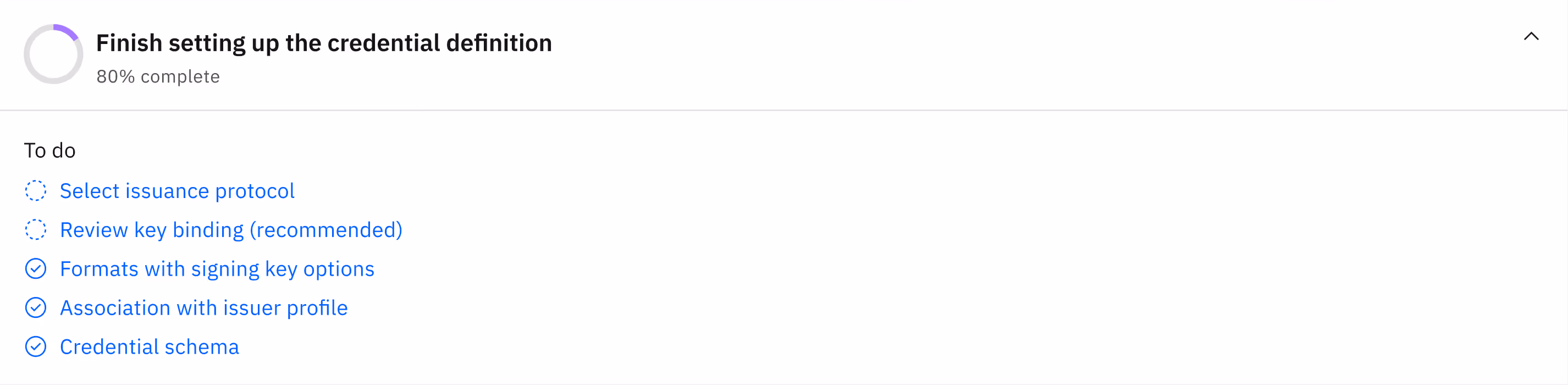
We needed to de-risk the MVP before dev started building. OOUX helped us getting to a tangible set of user tasks flows that became our blueprint for mid-fi designs. But this was brand-new technology with zero established mental-models. We didn't know if the language, groupings, or flow made sense to real admins.
So we ran concept tests with our mid-fi designs with 4 admins and few SMEs. We tested mid-fis, not polished hi-fis. Some visual feedback wasn't actionable yet. But getting directional validation early > perfect feedback late.
Identified 3 major UX problems before a single line of production code was written. That prevented weeks of rework.
#1 Don’t know where to start
#2 Attribute mapping nightmare
#3 Confusing technical jargons
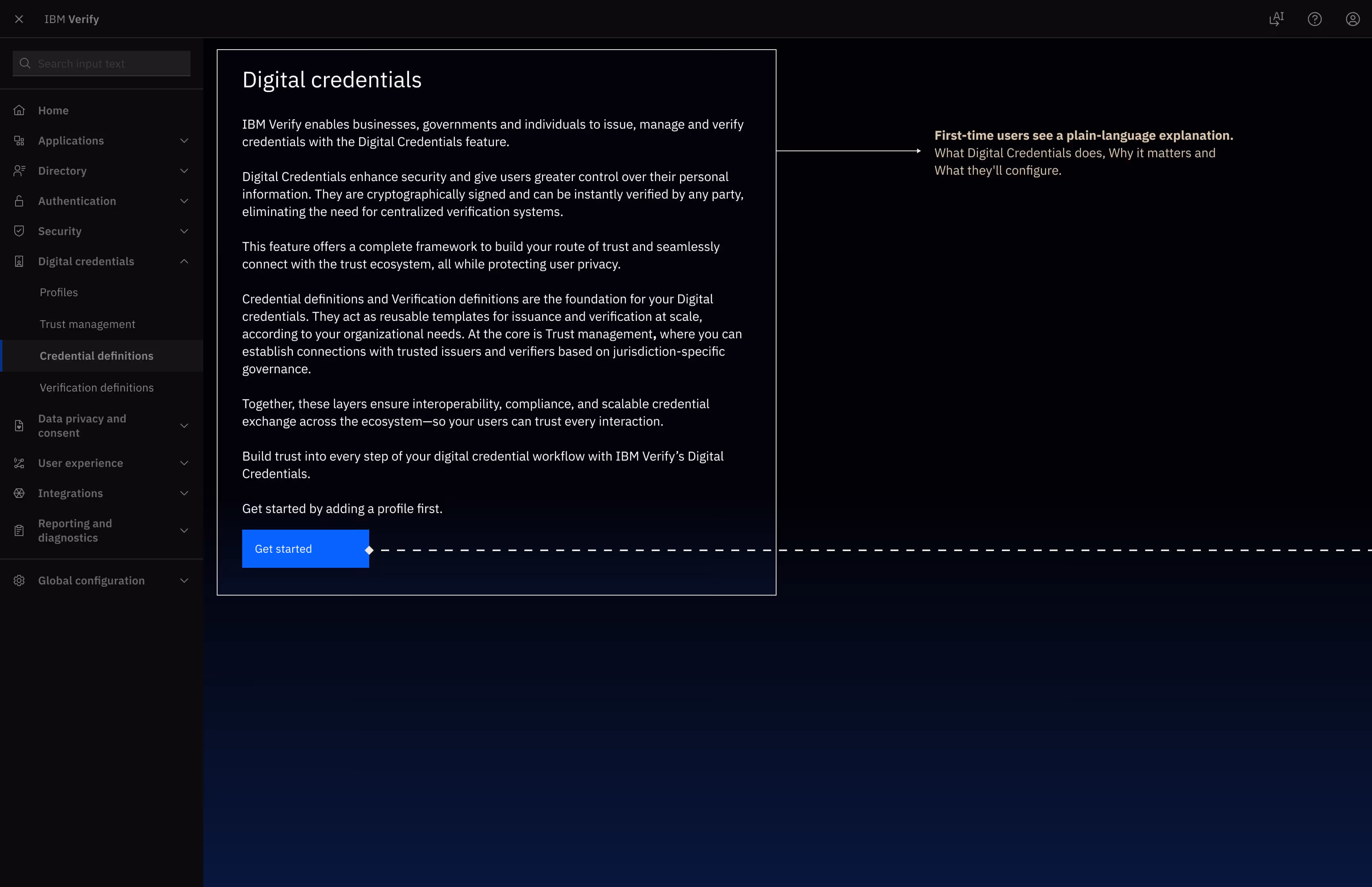
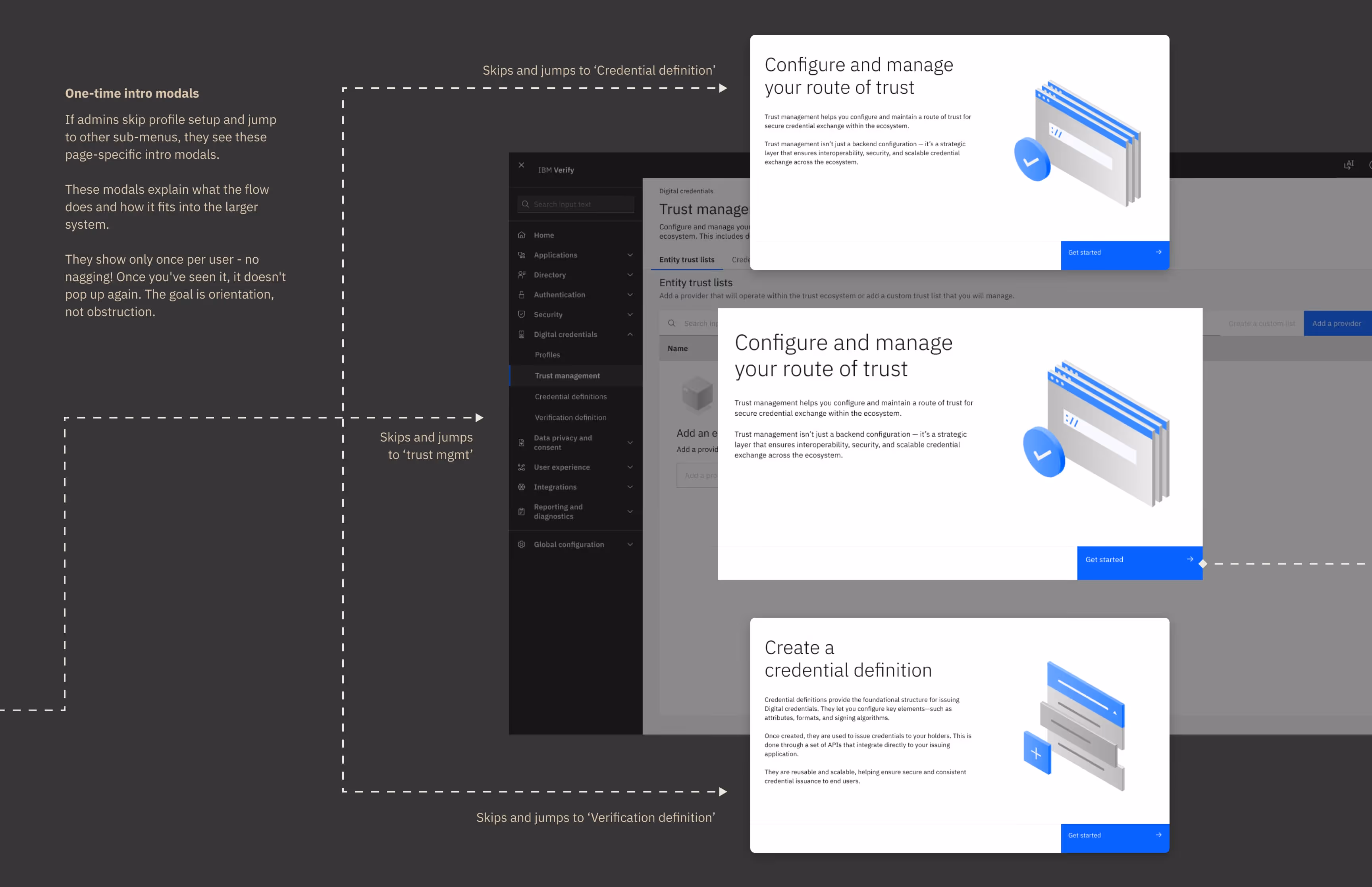
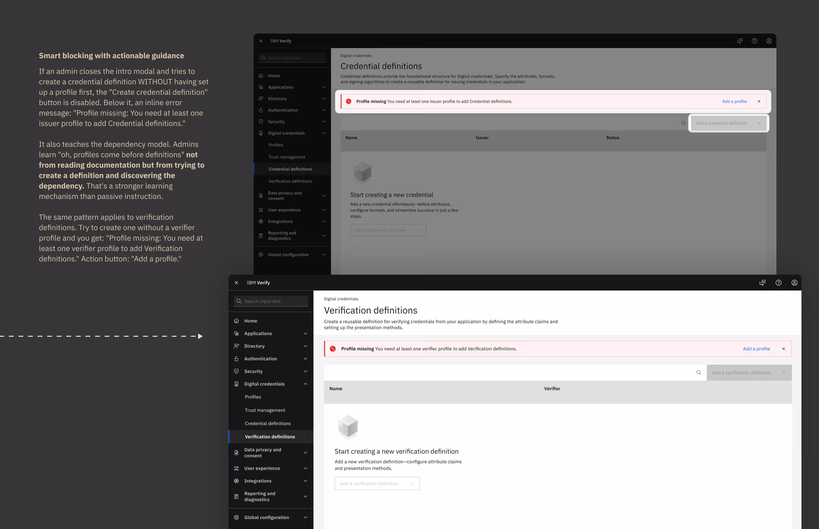
During testing, one of the participant was confused. "Where do I start?" he asked. He clicked around, read the intro modals, but still wasn't sure if he should first.
If first-time users land in the wrong place or try to create things out of order, they will hit dead ends. How might we guide first-time users through an interconnected system with dependencies?
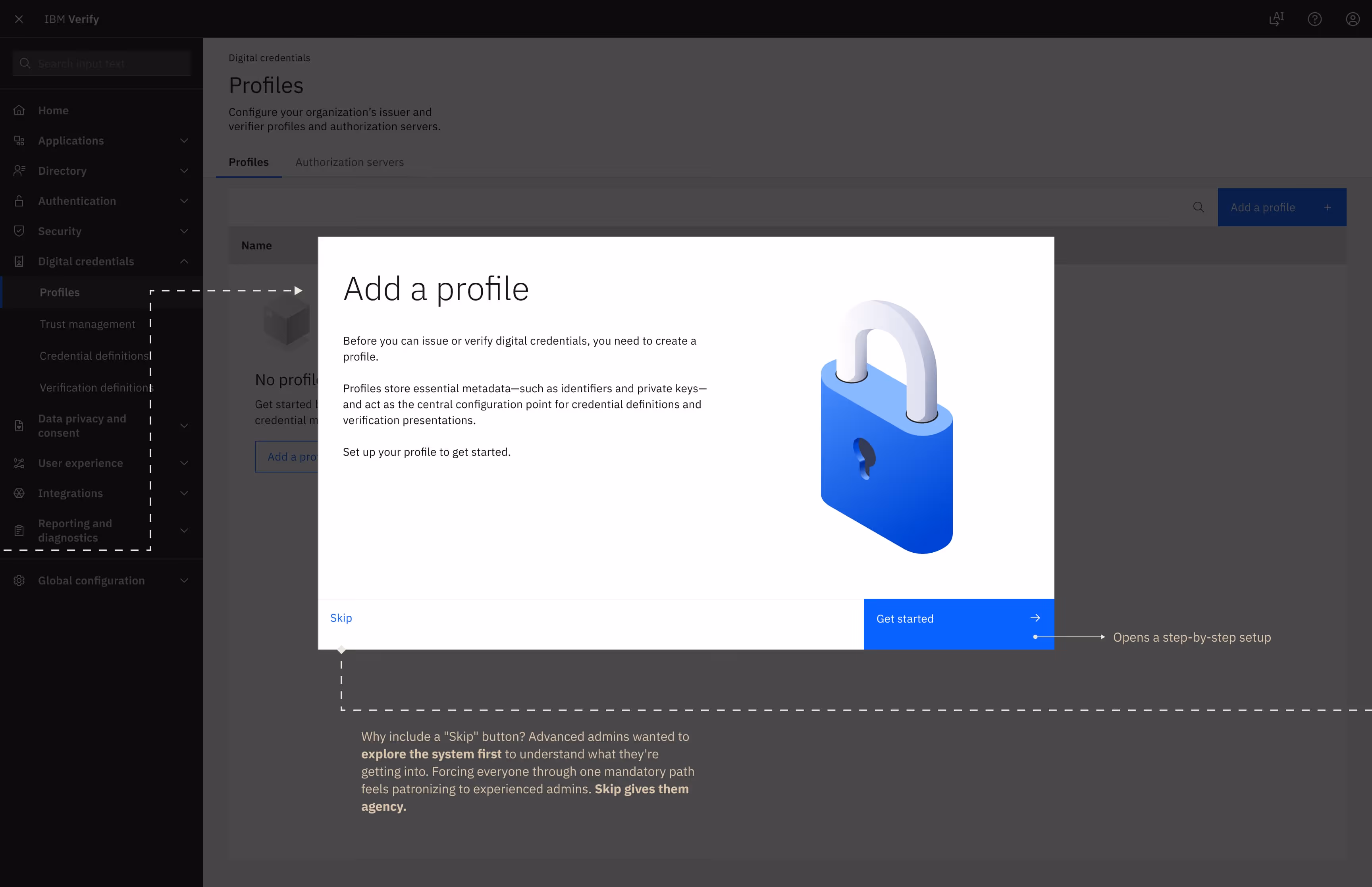
Profiles store your organization's identity, cryptographic keys, and metadata. You need a profile to issue or verify credentials.
Trust Management establishes trust lists and trusted entities. It defines which organizations you trust to issue credentials. This can exist independently of profiles.
Credential Definitions configure what types of credentials you can issue - like employee badges, driver's licenses, insurance proofs. This requires an issuer profile. Verification Definitions configure what types of credentials you can verify and what claims you expect, what presentation formats you accept. This requires a verifier profile.
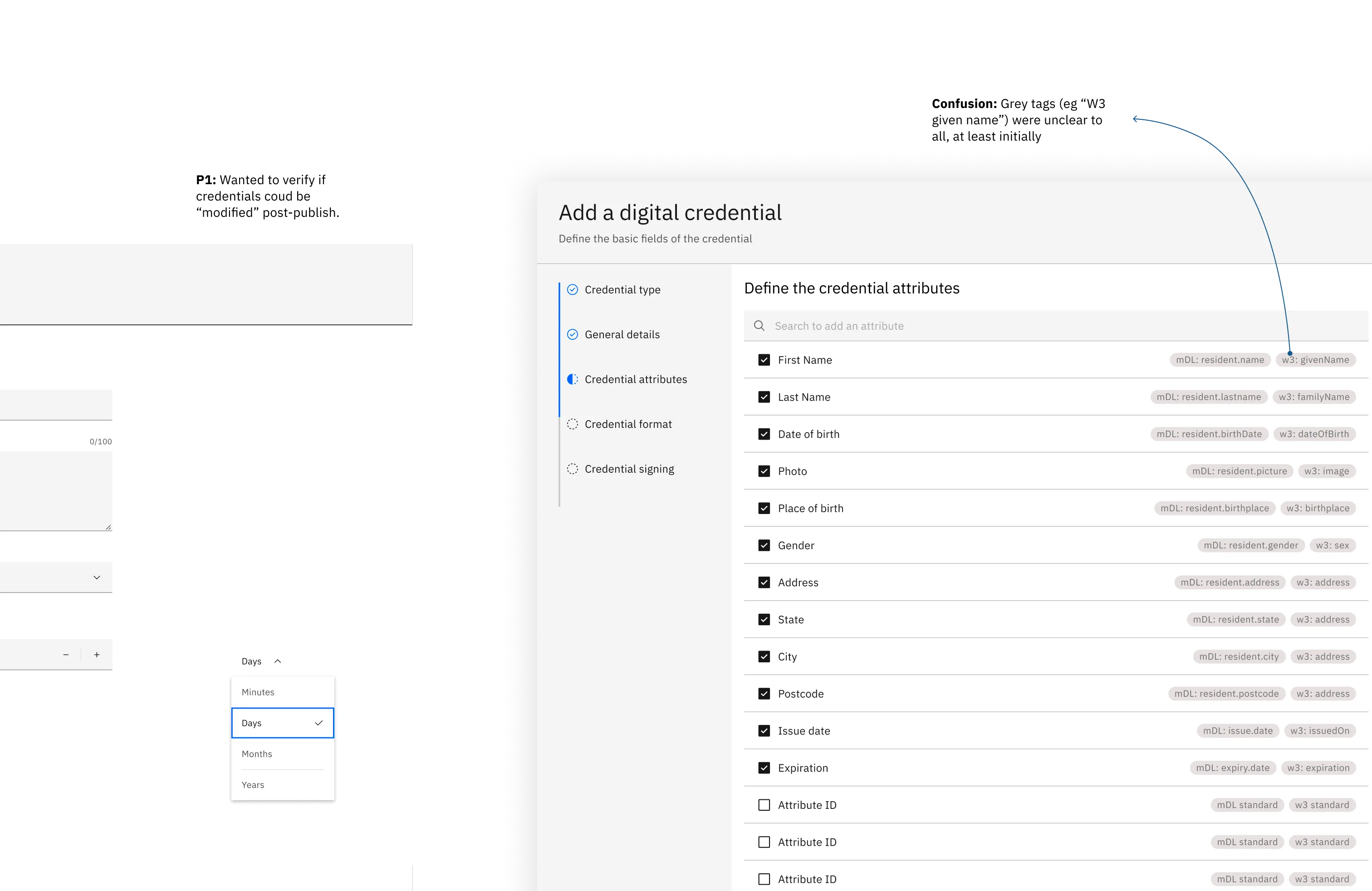
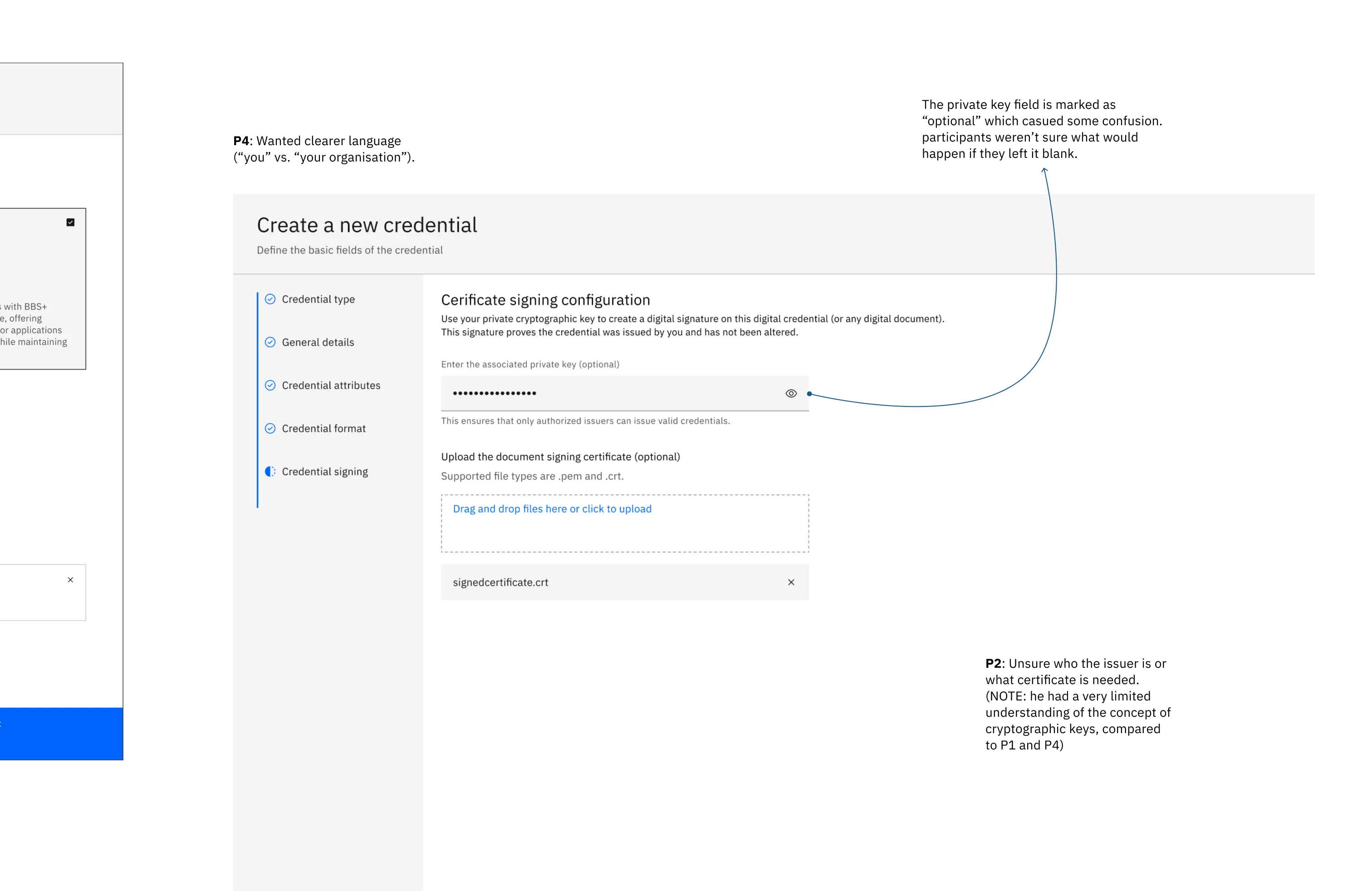
Admins can create ANY type of credential with ANY attributes, but those attributes must map to standards to be interoperable.
Expecting admins to know that "given_name” maps to “ISO/IEC 18013-5 section 7.2.1" is absurd!
A driver's license issued by Maharashtra might need to be verifiable by a bar in Sikkim! This interoperability is the whole point of decentralized identity. If attributes don't map to standards, credentials can't be verified across ecosystems.
So I collaborated with my architects and built a library of 50+ predefined attributes that handled the mapping for admins. Instead of asking them to figure out that "First Name" maps to ISO/IEC 18013-5's "given_name" field, I designed a searchable library experience
I could have gone with free-text only. Maximum flexibility. Admins can call attributes whatever they want. But that guarantees interoperability failures. Credentials that can't be verified are useless.
I could have gone with a standards dropdown where admins select from ISO definitions. But that's too technical - and it assumes admins are willing to read ISO specs, which they're not.
This library prevented admins from accidentally breaking interoperability.
Helper text worked for advanced users who wanted to customise. But testing revealed a different user type - the novices. They didn't want to read, didn't want to understand cryptographic formats, didn't want to become ISO standards experts. They want to jump quickly over the setting-up phase and make updates over time. They just wanted it to work.
How might we let novice admins configure credentials without understanding the technical stack?
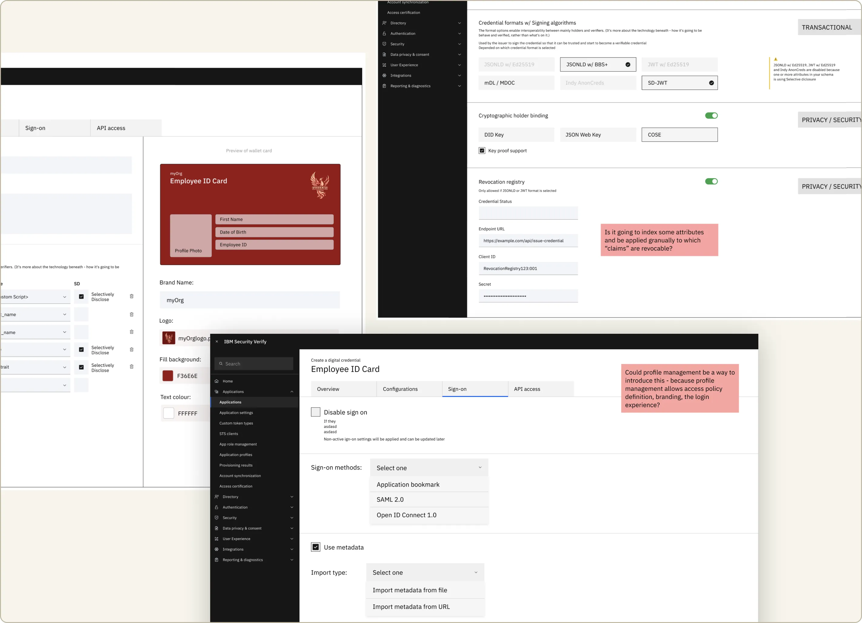
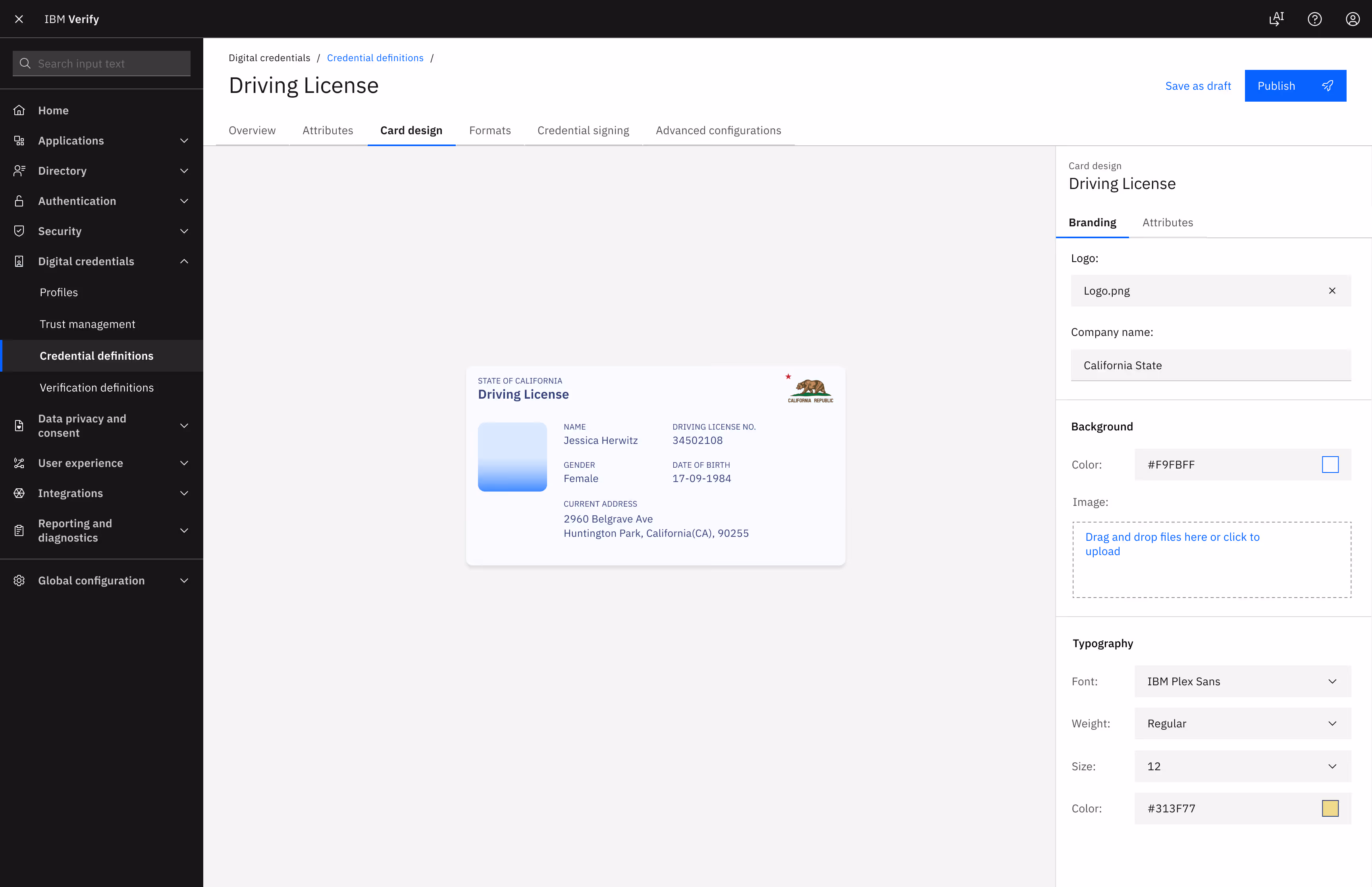
So I designed a starter library of templates (Driver’s Licenses, Passports) that auto-maps complex metadata and provides smart-defaults. These templates weren't based on arbitrary choices. Each template encoded best practices based on the use case. The templates answered the question "what does a well-configured credential definition look like for this scenario?"
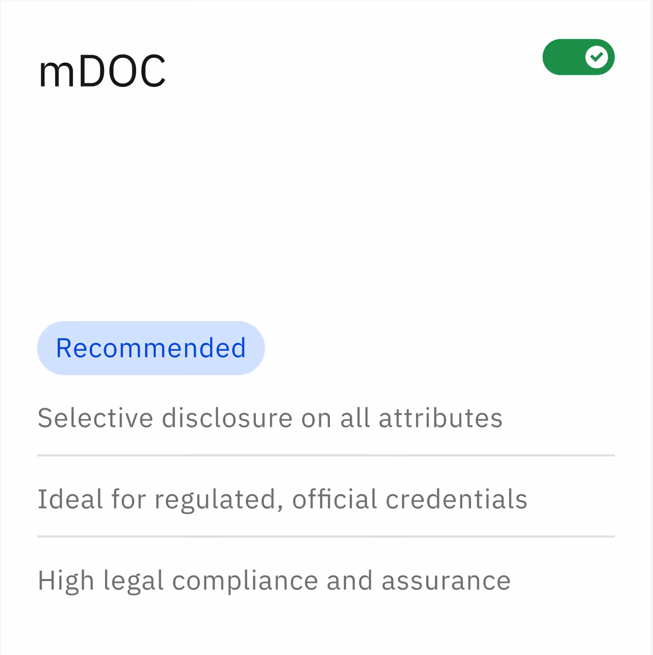
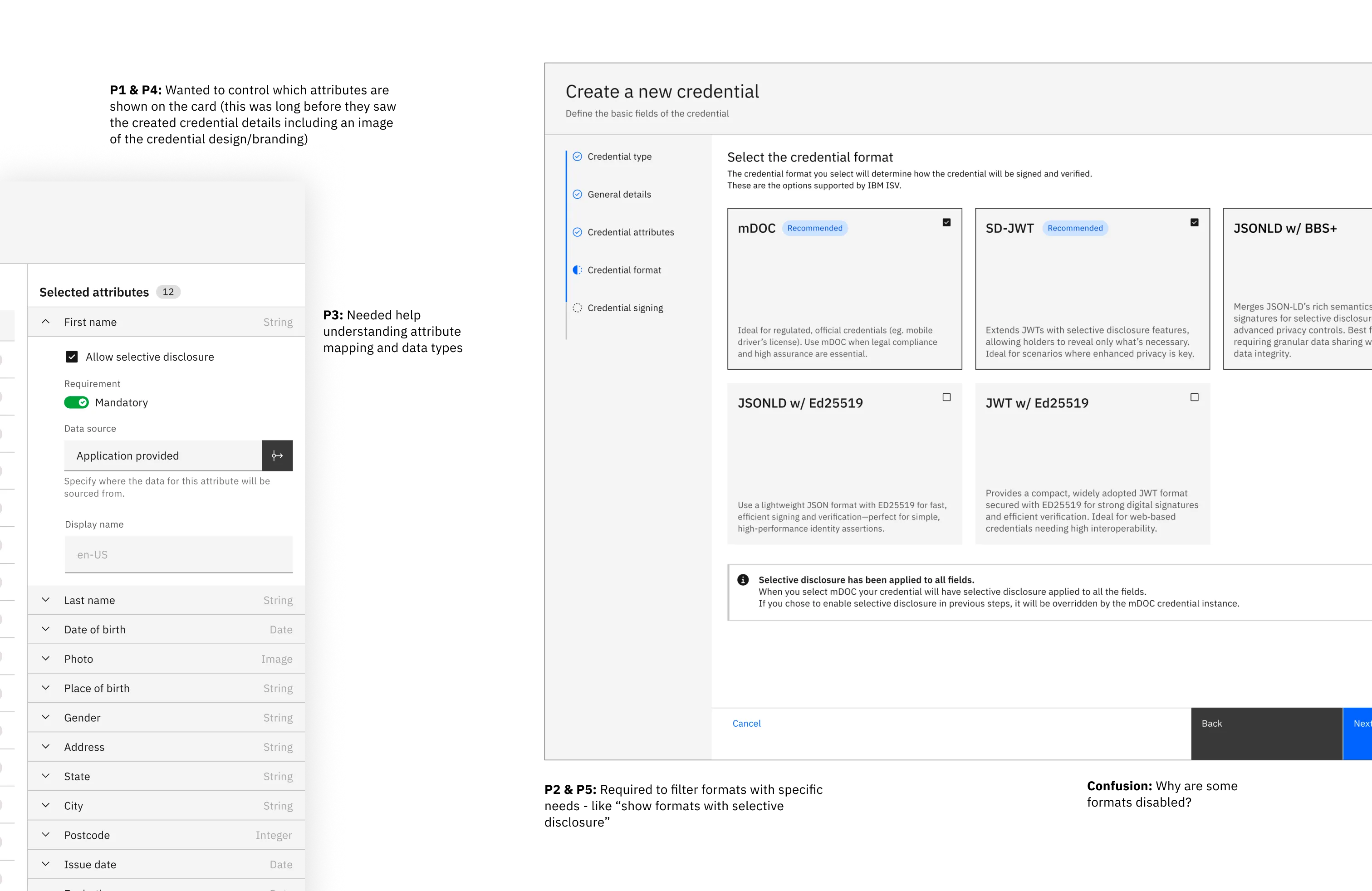
For example: Mobile Driver's License was the first. It pre-populated attributes that every mDL needs: Date of Birth, License Number, Photo, Full Name, Address, Expiration Date. The format was auto-selected as mDOC because ISO 18013-5 requires it—that's not a choice, it's a standard requirement. Offline verification was turned ON because law enforcement officers need to verify licenses without internet connectivity during traffic stops. Selective disclosure was enabled for DOB and Address because those are privacy-sensitive fields where holders should control what they share.
Standard practice in decentralized identity is to hide trust framework complexity. Even though this tech revolves around it, most vendors handle it automatically in the backend. Competitors were taking this approach for simpler demos and cleaner UIs. But we were designing for regulated industries like Governance, Banking or Healthcare. These organisations demand transparency because they need to prove to regulators exactly how credentials are validated.
I realised that Trust is a design problem, not a technical one. So I started advocating for making all the “route-of-trust” surface up with clean Information hierarchy.
Surfacing these settings in our flows built confidence. Our test users could see "this credential validates through these trust entities in this sequence." They understand how the system works. Understanding builds trust. Trust builds adoption.
Adding trust framework visibility adds perceived complexity to an already complex feature. When you're showing admins trust lists and route-of-trust configurations, you're asking them to understand another layer of the system.
Competitors had simpler demos because they didn't show this. Our architects weren't sure users would understand it. There was no direct user request for it in any of our research.
Here's my reasoning. Compliance officers in government and banking don't just need security, they need VISIBLE security. They need to be able to say "here's our trust framework configuration, here's how we're interpreting EU eIDAS regulation, here's the route of trust for credential validation."
If we hide it, they can't audit it. If they can't audit it, they can't buy it.
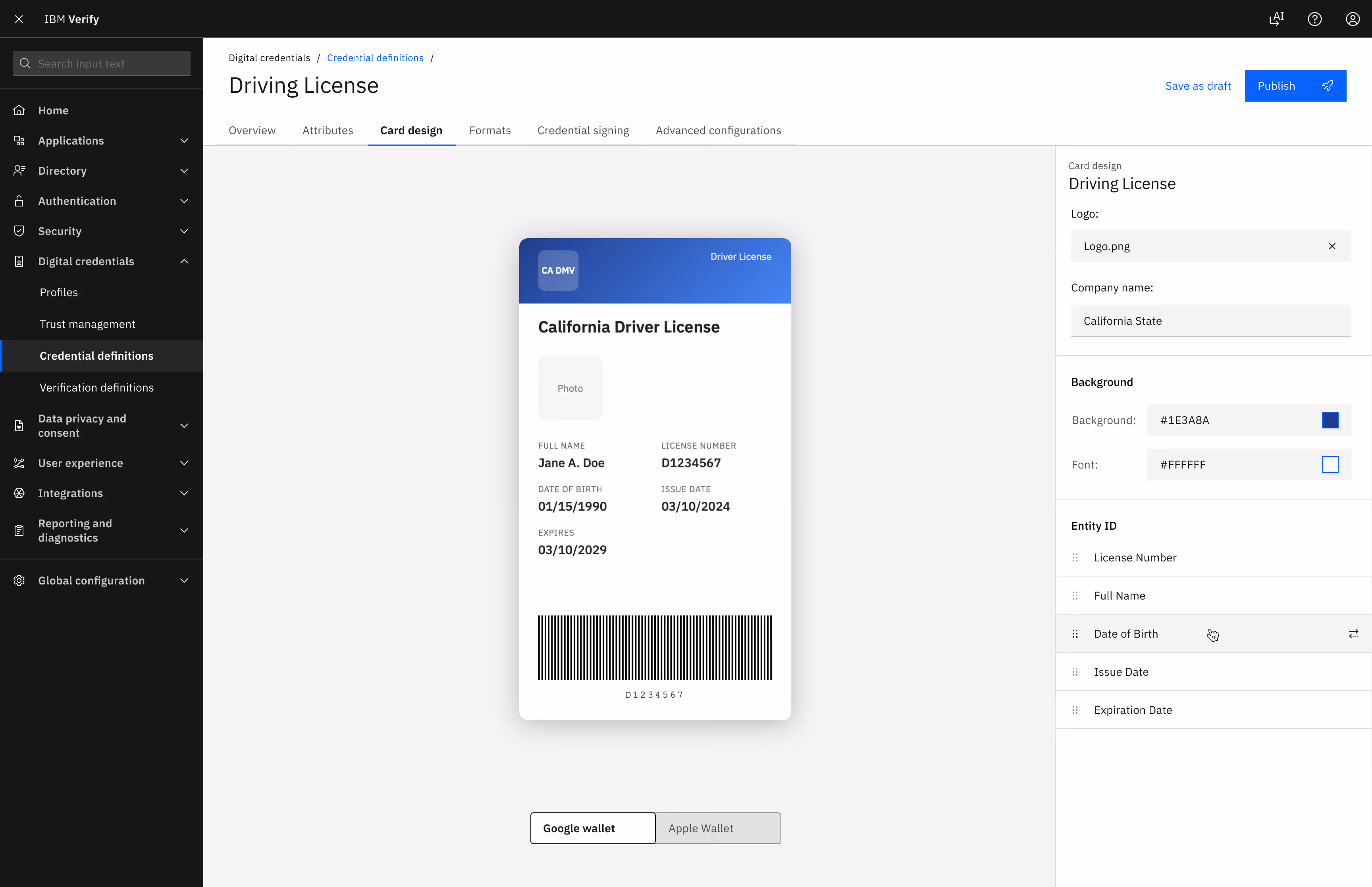
Initially, we had designed to support extensive credential card styling. Users could customize card layouts, text styles, add holograms, match brand identity. We were confident because research showed users wanted it.
Competitive analysis proved competitors only offered background/text color. We'd blow past them. Sales loved it: "This is our booth magnet."
But as it turned out, for end-users these credentials live in Google Wallet or Apple Wallet. Both enforce strict templates. Fixed layouts. Platform typography. No custom styling.
Every credential looks identical to end users. All that customization? Invisible.
We had to kill it.
But I kept and advocated for the "Card Style" tab. Two reasons:
1. Future-proofing: If IBM builds a wallet, we need somewhere to configure org branding. This is it.
2. Preview as validation: I pitched shifting the value from customization to verification. Admins preview how credentials render in Apple Wallet or Google Wallet with sample data. This catches mistakes before production—wrong mappings, missing fields, formatting breaks.
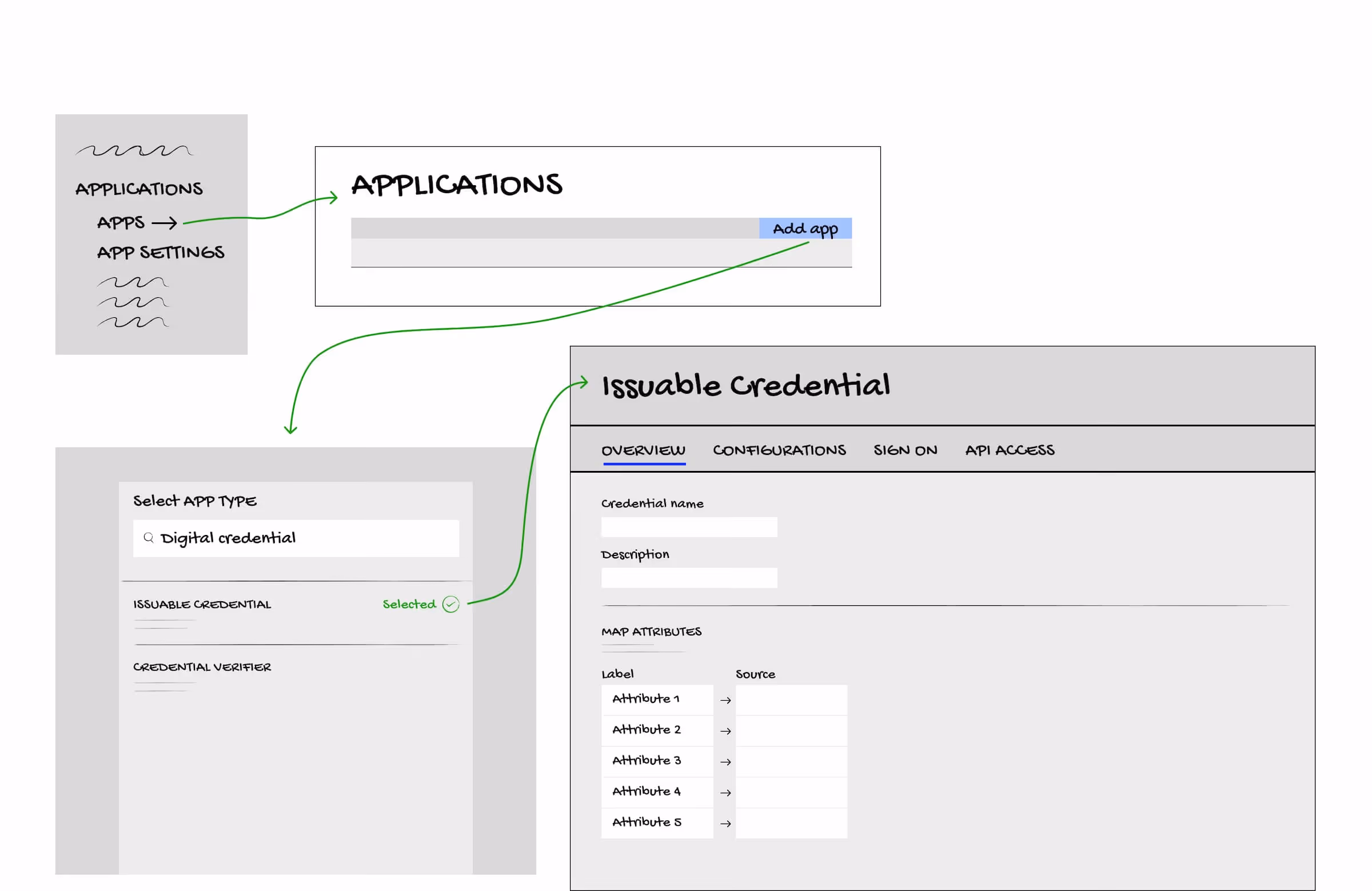
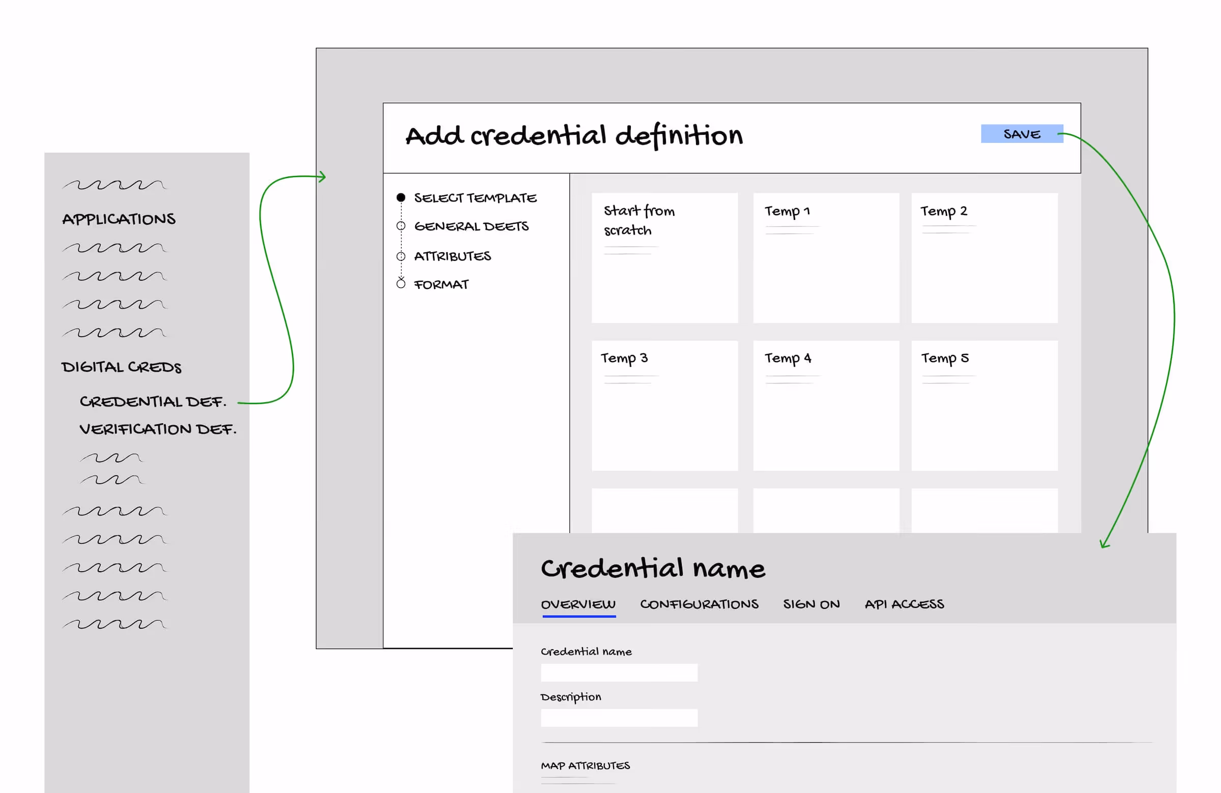
I led the architectural pivot that saved Digital Credentials from becoming a "hidden feature" buried in legacy debt.
Initially, engineering pushed Digital Credentials within the existing "Add Application" flow because, technically, it used the same backend boilerplate. This would have forced the user-flow into a Tab-based structure, allowing admins to jump between settings in any order - a recipe for catastrophic errors in a dependency-heavy tech stack.
I advocated for pulling the feature out of the "Application" universe. By moving to a Linear Tearsheet Wizard, I created a "guardrail" experience that forced a logical setup sequence. This move also ensured that when the feature scales to IBM Verify Access and Verify Governance, the UI remains consistent and the dev effort is halved.